Meme Archive App Development | Alpha Testing + Pre-Production
Devan Lee
Introduction
Programming is something that I've always been passionate about. I have always loved programming, and creating cool little projects with different coding languages, from creating simple chat bots with Python to Object-Oriented programming with Java.
But one thing that I've always been interested in is App development.
I've always been curious as to how mobile and web apps were developed, and created, but I never really had the opportunity to identify and learn how these systems worked.
Curious, and determined to learn, I went down the rabbit hole of App development, React and React Native, and other scripting.
----
App development meets itself at a crossroads within my life: entrepaneruship, coding, and self-sufficiency.
With App development, you can start up your own business with apps you create to identify and solve a problem in which people would pay for - which excites me. I've been inspired by other developers, Y-Combinators, Silicon Valley success stories, who, with their apps, have generated major commercial success - and I've wanted to replicate that.
Apps like DoorDash, FaceBook, TikTok, developers like Elon Musk, Tony Xu, Mark Zuckerberg have fascinated me, and inspired me to somehow, someway, get into this field.
Coding, itself, has always been position of mine. I like building things, but I also like building things to call my own, building things independently, by myself, and because I want to.
That leads to the other topic: self-sufficiency. As much as I enjoy coding, I don't enjoy coding to help support another goober's business. Because that just takes the fun away from coding.
Anyways though, I wanted to learn app development because I was inspired by previous developers and their success, and because I've been curious about the process it takes to develop a mobile/web-app.
And with that, I taught myself, within about 2 months, how to use languages like React and React Native to develop, and publish applications.
The learning curve was easy, anything can be learned on YouTube or Internet courses. React itself, is fundamentally, very similar to HTML, and CSS - given it's layout. JavaScript and TypeScript, additionally, are also indecently very easy to understand and navigate through. Ok, maybe that's false- but learning is still pretty intense, and I enjoy the difficulty.
Anyways, I taught myself, React Frontend, API, how to navigate through everything. Originally, I initially started with Vite, but I migrated more towards React Native, and TypeScript, once i figured out what I wanted to do with these skills.
Idea Showcase | Problem it solves.
With every app developer, there needs to be an App developed (Duh). But I didn't know what to develop, so I began to brainstorm.
Good apps, typically need to be something that the everyday person can utilize, something that an app can solve.
I had some apps in mind initially that I had wanted to develop- but for my first app, I wanted to create something pragmatic, and useful. Something that even myself would use.
I began to brainstorm, and came up with a few different ideas:
- Hmong Writing & Reading Learning app | KawmHmoob
- Penpal writing app, which helps you write meaningful words to people you care about - reach out app. | Engage
- Meme Cloud Saving & Sharing App | MemeArsenal
The problem each of these solves:
- Hmong Writing & Reading Learning app | KawmHmoob
This would app would function as a DuoLingo language learning type app. I'm Hmong, and I love my language, and my culture.
But the main problem that I have with being Hmong is being unable to understand my language fully. I can read and write in standard RPA Hmong, but I can't comprehend or speak Hmong fluently, or have a conversation in the language. T
his is a problem that I have personally. But I'm positive that there are other Hmong-Americans, and even non-Hmong people out there who would love to learn how to read / write / comprehend the language.
Unfortunately, there isn't really a dedicate course for the language, and the courses available don't really have the capability for long term effective learning. There isn't a free recourses out there to learn Hmong effectively, in a course type of way - and no DuoLingo type app equivalent that is sophisticated.
This is what had inspired me, because this is something that I know that I would use myself. Importantly; it would help me connect better with my own culture. Imporatnly, this app would allow other people to learn how to read/write in Hmong, The development of this app would also assist me with learning how to develop and publish learning apps, which is something that I've always be interesting in doing.
- Penpal writing app, which helps you write meaningful words to people you care about - reach out app. | Engage
This app idea originated from the movie "Her" (2013) directed by Spike Jonez, and starring Joaquin Phoenix. In the movie, there is this website called, "beautifullywrittenletters.com" where people can pay people into writing deep, heartfelt messages to other people that they care about, if they lack the creative intuition to do so.
The movie touched my heart, and inspired the idea for the app. Unfortunately, there are no real apps or services that really provide this type of service on a freemium level, so I figured it might work as a great way to create an app to fulfil this niche. If I were to create this app, then I would want to call it, "Engage" - and the main function of the app is helping people engage more deeply with their loved ones.
The app would help people reach out to old friends by assisting them with drafting messages, or letters of appreciation. The core concept of the app would be to help people write deeper, more meaningful messages to connect better and create closeness. It's important to recognize, understand and appreciate the people who you love the most in your life - and this app would provide that assistance. But I dont want the app to just become "AI writes your messages for you," bullshit app, cuz that could feel inauthentic. I envision that it's more like a thoughtful prompt/guide that helps people express what they already feel, and allow them to execute it better.
The app would identify people in your life from contacts or social media, and help you draft messages from anything, from letters of appreciation, to flirting, to writing apologies, to just writing more deeply. A good message from someone is always good to have. The app would also utilize AI assistance with writing to help guide the user in writing better.
Example:
- Reconnecting with old friends ("Hey, it's been years—remember when...?")
- Letters of appreciation/gratitude (to parents, partners, mentors)
- Apologies that feel sincere and thoughtful
- Flirting/romantic messages that build intimacy
- Everyday check-ins elevated to meaningful
There isn't an exact 1:1 match for a dedicated, freemium app focused purely on personal/relational deep messaging like the movie's service. No prominent "BeautifullyWrittenLetters.com"-style human-written letter service dominates today.
And I think that's important to build stronger connections with the people that you care about in the world. We are on this Earth to live, laugh, and love - and isolating ourselves from the people that we care about is a problem that many people face.
The app would also work as a pen pal app, and gifting app. You can write to people all around the world, even gift random people presents on their birthdays.
But like the pen-pal functionality would only be a segment of the app, and not a core functionality. But importantly, I would like to build this app to also learn about AI integration into applications as well. I took big inspiration from AI integrated apps like Grammarly, and Cal.Ai, so I would want to create something similar and utilize AI technology in my own app.
- Meme Cloud Saving & Sharing App | MemeArsenal
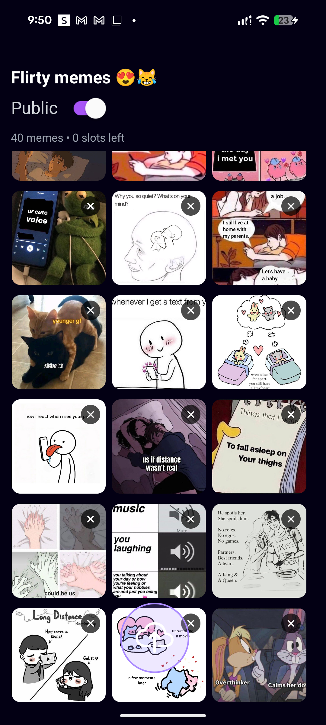
This app idea originated from my love of memes, and my need to organize them. I collect memes, memes for different contexts, things like flirty memes, reaction memes, memes for telling people to shut the fuck up, etc.
But my problem with collecting memes is organizing them without taking too much space. Originally, I created a files on my Google Drive account to hold memes - but the problem with this was that there wasn't a way to actively anonymously share these folders of memes with other people, or independently create links to share and send these memes to people.
Eventually, that became tedious, and every meme that I saved from the internet eventually became saved to my camera roll, and then that became tedious because nothing was organized anymore - making finding that one relevant meme tedious to do.
I love memes, memes are like, one of the greatest things on Earth. But I realized that there is no dedicated way to accurately categorize, save and share them - or share folders containing memes that I've saved with other people who would be interested in seeing what I have.
That gave me the idea for my next app: A Meme saving app that utilizes cloud technology to help users save, and categorize their memes for ease of use. Each person would have their own account, and the ability to create multiple folders to save different memes for a relevant context. Users would also have the ability to share both individual memes efficiently and quickly, and also share their folders of memes if they wish.
This solves a problem both for me, think of it like, Pinterest, but for memes. People can save their own folders of their categorized memes, and effectively find that one relevant meme to share it.
I have always been fascinated with Cloud technology, and I wanted to integrate it into this app. Cloud storage is one of the most pivotal technologies in the modern tech world, allowing for storage to be accessed and retrieved effectively, and quickly. It's one of technologies best creations, and I have always wanted to implement this into something I created.
Additionally, I have always wanted to make a "social media" app, something like Instagram, or X, where people can share, like, dislike things they post or see, and have independent profiles. That's something that I've always wanted to create, and I realize that this MemeArchive App idea could probably cultivate this. A social media app that uses Cloud technology, dedicated for sharing and storing memes with other people, sounded so good in my head, and also solved a pivotal problem that I had in my own life; sharing memes.
----
I decided that for the first app I would make would be the Meme Archive sharing app, because I figured it would probably best learning step to understand and immerse myself with cloud technology, backend, coding, etc and because I reasoned it would be the most useful app.
Plan + Layout
I had to think of a plan for the app, and identify validations for the app before commiting to the development. Here is a basic alpha blueprint layout for the app that I drafted;
Overview:
Memeify is a cross-platform meme management application that enables users to save, organize, and access memes through an intelligent cloud-based library system. Users can import memes from their camera roll, save directly from the internet, or select from a curated collection of recommended memes. All content is stored via cloud service, ensuring seamless synchronization across mobile and desktop devices. The library interface provides quick search and filtering capabilities, allowing users to locate and deploy the perfect meme within seconds.
Functionality
Core Features
Library System
- Organized, browsable meme collection
- Quick search and filtering capabilities
- Clean, intuitive interface
AI Auto-Tagging
- Automatic categorization when users save memes
- Multi-category tagging: emotion + use-case + topic
- Examples: funny, reaction, sports, flirty, roast, celebratory
Cloud Sync
- Access library across all devices (phone, tablet, desktop)
- Seamless synchronization
- Cross-platform accessibility
Curated Collection
- Recommended memes users can save from catalog
- Discovery feature for high-quality memes
- Regularly updated content
Meme vault for friend groups
- Shared folders per group (e.g. “Roommates”, “D&D group”, “Work shitposting”).
- Roles: who can add, who can curate, who can pin “hall of fame” memes.
- Easy invite link: drop it into a group chat and the vault is instantly populated.
Archive System
- Save memes from anywhere (camera roll, internet, other apps)
- Import from multiple sources
- Preserve meme collections
“Reaction keyboard” powered by the cloud
- Save memes in the app → they’re instantly available as a keyboard/extension (like Gboard but for the personal meme folder/archive).
- Tag memes by emotion (angry, wholesome, cursed, etc.)
- When typing in WhatsApp/Discord/whatever, tap the keyboard and instantly send the right meme.
Shared “meme boards” like playlists
- Users or curators can make boards like for example: “2024 niche dank memes”, “Wholesome night memes”, “Work-safe memes”.
- People follow boards, not just users.
- Friends/Groups can collaboratively build boards.
----
User Flow
- User finds a meme they like (on Instagram, Twitter, Reddit, etc.)
- Saves it to the app
- AI automatically tags it (funny, reaction, sports, etc.)
- Meme goes into their organized library
- User can also browse curated collection and save memes they like
- Everything syncs to cloud - accessible on any device
- When they need a meme, they search/browse their library and send
Problems It Solves
- Disorganized Meme Storage: Users currently store memes in their camera rolls mixed with thousands of personal photos, screenshots, and documents, making retrieval time-consuming and frustrating.
- Lack of Categorization: Without proper organization, users cannot efficiently sort memes by context, emotion, or intended use, leading to wasted time scrolling through unsorted collections.
- Cross-Platform Accessibility: Memes saved on one device are not accessible on others, forcing users to repeatedly save the same content or rely on fragmented storage solutions.
- Discovery Limitations: Users lack a centralized source for discovering and saving high-quality memes, relying instead on random social media encounters.
- Search Inefficiency: Traditional photo apps offer no contextual search for meme content, making it nearly impossible to find specific memes when needed.
Technical Stack
Frontend
-
React
- Fast development experience
- Modern build tooling
- Component-based architecture
-
Platform Strategy:
- Mobile: React Native for iOS + Android (shared codebase)
- Web: React (share components with React Native)
- Desktop: Consider Electron or Tauri (future phase)
Backend Options
-
Primary Recommendation: Supabase
- Open-source, Postgres-based
- Built-in auth, storage, and real-time capabilities
- Self-hostable for full control later
- Best balance of features, scalability, and developer experience
-
Alternatives:
- Appwrite: Open-source Firebase alternative with built-in storage, auth, and database
- Pocketbase: Lightweight, single-file backend, great for MVPs
Cloud Storage
-
For MVP/Testing:
- Cloudflare R2 (Recommended): 10GB free storage, no egress fees (best value), S3-compatible API
- Supabase Storage: 1GB free storage, simplest if already using Supabase backend, easy client-side encryption implementation
- Storj: 25GB free storage, decentralized storage with encryption, best for privacy + decent free tier, S3-compatible API
-
For Production (Paid but Affordable):
- Cloudflare R2: ~$0.015/GB/month, zero egress fees
- Backblaze B2: Cheapest at scale ($0.005/GB/month)
-
Privacy-Focused Alternatives:
- Proton Drive: E2EE, Swiss privacy laws (no public API yet)
- Tresorit: Zero-knowledge encryption, has API access (expensive)
- IPFS + Encryption: Fully decentralized (complex implementation)
- Self-hosted Minio: S3-compatible object storage with client-side encryption
AI Auto-Tagging
-
Recommended Approach: Start with Google Cloud Vision API for cost-effectiveness, then consider premium options for better meme understanding.
-
Options:
- Google Cloud Vision API (Recommended for MVP): ~$1.50 per 1,000 images, excellent for image labeling, object detection, most cost-effective
- Claude Vision API: ~$0.01-0.03 per image, excellent at understanding context and humor in memes, good for production
- OpenAI GPT-4 Vision: ~$0.01-0.03 per image, strong image analysis capabilities, alternative to Claude Vision
- Open-Source Options (Future Cost Reduction): CLIP (OpenAI): Open model for image-text matching; BLIP-2: Image captioning and tagging; LLaVA: Open-source vision-language model; Host on own infrastructure to reduce costs at scale
-
Cost Projections: 1,000 users × 100 memes each = 100,000 images; Google Cloud Vision: ~$150; GPT-4/Claude Vision: $1,000-$3,000
-
Cost-Saving Strategies: Cache tags to avoid re-analyzing; Batch processing; Consider on-device models for future (free but slower)
Privacy & Security Strategy
Encryption Approach
-
Client-side encryption before upload:
- Encrypt memes on user's device before uploading
- User holds encryption keys (never leave device)
- Zero-knowledge architecture - backend only stores encrypted blobs
- Even if subpoenaed, data cannot be decrypted
User Authentication
-
Supabase Built-in Auth:
- Email/password with email verification
- Social logins (Google, Apple, Twitter)
- 2FA for security-conscious users
- Password recovery flow
-
Challenges
There were some challenges that I had to face when blueprinting, I logged them here:
Critical Implementation Considerations
-
Content Moderation & Legal
- Challenges: DMCA/Copyright (memes often use copyrighted images/characters); Illegal Content (need automated scanning); Liability (tension between privacy and safety)
- Solutions: Scan/tag images before encryption; Implement user reporting system; Use AI moderation (Google Cloud Vision SafeSearch, AWS Rekognition); Clear Terms of Service and community guidelines
-
Image Optimization & Bandwidth
- Challenge: Raw meme images (1-3MB) × thousands of users = high bandwidth costs
- Solutions: Compress images on upload (WebP format, 80-90% quality); Generate thumbnails for library browsing; Lazy loading in the app; Use Cloudflare's free CDN for faster delivery
-
Search & Filtering Performance
- Challenge: Fast search with thousands of memes per user
- Solutions: Index tags in database (Supabase/Postgres full-text search); Consider Algolia or Meilisearch for advanced search (Meilisearch has self-hosted free option); Cache frequently accessed memes
-
Offline Functionality
- User Expectation: Browse memes without internet
- Solutions: Cache recently used/favorited memes locally; Sync when online; Clear offline vs online state in UI
-
Sharing & Exporting
- How users send memes: Direct share to messaging apps (WhatsApp, iMessage, Discord, etc.); Copy to clipboard; Download to camera roll; Built-in messenger (overkill for MVP)
-
Data Privacy Compliance
- Requirements: GDPR (Europe): Right to deletion, data portability, consent; CCPA (California): Similar privacy rights
- Implementation: Clear privacy policy; Data deletion endpoints; User data export functionality; Cookie consent (if web app)
I also needed to ensure that users would have limits to the imports. So, I decided, for now, that users would only be able to create a limited number of folders, upload a limited number of files within a storage limit, as to not take up too much Cloud storage.
Development Plan:
Phase 1: Core MVP
- Goal: Working prototype with essential features
- User authentication (Supabase Auth)
- Upload & save memes (camera roll, direct import)
- Basic AI tagging (Google Cloud Vision) - possible
- Simple library view with search
- Cloud sync (Cloudflare R2 or Supabase Storage)
Phase 2: Enhancement
- Goal: Improved user experience and functionality
- Advanced filtering/categories
- Curated collection feature
- Image optimization (compression, thumbnails)
- Sharing functionality (export to messaging apps)
- Offline caching
Phase 3: Growth & Monetization
- Goal: Scale and revenue generation
- Content moderation system
- User-generated content features
- Social features (sharing, collaboration)
- Monetization implementation
--------
Monetization Strategy (Future)
-
Freemium Model
- Free Tier: 500 memes, basic features
- Paid Tier: Unlimited memes, advanced features
-
Subscription Pricing
- $2-5/month for premium features
- Annual plans with discount
-
Alternative Revenue
- Ads (less ideal for user experience)
- Avoid NFTs: Market is largely dead
----
Beta Testing Plan
- Target Group: Small initial group (friends, Reddit community); Expand gradually based on feedback
- Feedback Areas: Tag accuracy; Search usefulness; UI/UX pain points; Feature requests; Performance issues
- Iteration Strategy: Gather feedback systematically; Prioritize based on user needs; Iterate before public launch
------
Key Success Metrics
User Engagement
- Daily/monthly active users
- User retention rate
- Session length and frequency
Feature Usage
- Memes saved per user
- Most popular tags/categories
- Search queries (what users look for)
- Share/export frequency
Technical Performance
- Search response time
- Upload/sync speed
- App crash rate
- Cloud storage costs vs. revenue
Growth Metrics
- New user acquisition rate
- Conversion rate (free to paid)
- User referrals
- App store ratings
Analytics Tools
- Mixpanel: Comprehensive analytics
- PostHog: Open-source alternative
- Custom tracking: Build your own lightweight solution
Development process + showcase
After blueprinting, I began the development process, and started up a new GitHub Repo for the app, and booted a fresh React-Native scaffold on Visual Studio Code.
The first thing that I needed to implement was the layout of the app.
At first, I envisioned that the app would have 4 main pages on the base UI;
- Home
- Discover
- Upload
- Profile
The Home, or Index page, would contain the user's archive of saved folders. This is where this information would remain.
The Discover page would contain a UI that contains a stream of memes from Subreddits or X.com that the user can save to their phone. Users can use this page to find memes that resonate with them, and save them directly to a folder. I imagine that this folder would contain a search functionality that permits the user to search for certain subreddits, or X posts to find memes suitable for them.
The Upload page would contain a UI that would allow the users to create folders, and upload images. I imagine that the UI would contain the ability to choose the color of the folder, and provide a way for the user to name folder(s). That's what I think for now. I may implement additional features in the future. But my idea is this: this page would be dedicated solely for creating folders only.
BUT! If a user wanted to add images to their folder, that can do that independently through each relevant folder. Image implementation logic would function within a folder itself.
Finally, the profile page would contain the user's profile information. I imagine it would include the profile picture of the user, the user's information such as preferred name, how long they have been a member for, if they're a "pro" user or subscribed to a higher level within the service, and would also contain data letting the user know how much images + folders they have.
This would be a private, user-only page, meaning it would not be public for others to view.
----
This is the initial plan that I have in mind in the beginning, but I'm sure that I will include more pages in the future. Maybe one to two more pages determined by how I want the site to go.
I envision eventually, the site would work as a Pinterest / Instagram type social media app. I would include a user-search functionality to help users find other users to view their folders, if public. There would additionally be a friending system, and possibly a messaging system.
But yeah, that's what I have in mind.
Layout + Functionality
Implementing the layout onto the React-Native scaffolding wasn't so difficult.
When I started structuring the app, I focused first on the layout and how screens would flow together, instead of diving into visual details. I wanted a clear separation between authentication, the main tabbed experience, and any auxiliary screens like settings or detail views.
I began with the root layout. This is where I wired up global providers (for things like navigation, context, and theming) and defined the top‑level structure of the app. The root layout decides whether I show the authenticated experience or the auth flow, based on the current user/session state. Keeping that logic at the top level helped avoid having “am I logged in?” checks scattered across individual pages.
This is important because this is the first ever app in which I will implement a backend, so I wanted to use a backend user auth as much as possible to really immerse myself in the use of the technology - and also because ensuring that user login only would mitigate any leakage of a user's profile contents. So basically, I would implement a force check if a user is logged in logic on each page before a user views them.
For the main app, I want to organize the core experience into a tabbed layout.
Each tab represents a major slice of functionality (like browsing memes (Discover), viewing the archive (index), or managing settings). The tab layout itself only knows about which pages belong in which tab and how to navigate between them. Inside each page, I keep the logic focused on that page’s responsibility: fetching or reading data, managing local state (filters, pagination, etc.), and exposing clear actions (open details, save, share).
But for the settings, I would include an independent button for it - but not directly located on the main tabs UI.
Implementing this logic left me with this result:

Tabs for the profile:

and I also implemented a test with an unmatched route for a "settings" just for testing:

Oh yeah, for the icons representing each, I sourced them from this cool ass site called:
Don't mind the color scheme, it's just a placeholder for now... or maybe not. I kind of rock it. I decided to make the app default primary color scheme a dark / vibrant purple because purple is my favorite color, and it was easy on my eyes. This shade of purple was also kind of perfect. Not too dark, but also not too bright either.
Folders Logic
For the logic of the folders, I envisioned that the user would be able to create a folder containing images they could choose from the camera roll / phone files and then set them into a singular set folder.
The initial folder creation logic would happen occur in the Upload page, and the user would have the ability to name and set the color of the folder.
-
Every created folder would then be archived in the Index page. I figure for the ease-of-use, the folders would be organized chronologically.
-
On each folder, when accessed by the user, it would contain the images relevant to the folder, and there would be a transparent upload button within the folder which would allow for the user to upload more images to the folder.
Users could also remove folders by long-pressing on the thumbnail of each image.
-
For now, there would only be a limited number of folders that the user could create, and a limited number of images that could be uploaded to each folder.
I figured that a limit of 5 folders, with 10 images each would be a good starting idea - just to verify if everything could be doable.
-
There would additionally be a UI within the viewed folder which would contain an option for the user to make their folders private and public. Public folders could be accessed and interacted by other users, but unable to import or remove folders, and private folders could not be accessed by other users.
-
For the images, on each viewed folder, I imagine a neat set row of thumbnails containing every image the user has saved to that folder. And when an image is pressed, there would be a full screen modal which would showcase the entire image so that the user can see it better.
Next, there would additional UI which would appear underneath the full screen image which would detail the ability to Share, Favorite, and Export the image.
The Share button would allow the user to either create a specific link for the image to send directly (something that solves a problem I had with Google Drive) or share the image via the app.
The favorite button would allow for the user to add the specific image to a dedicated "Favorites" folder for the user, which would archive images that they like the most. I added this feature because I figured that, if this app were to become a dedicated social media app in the future, then a quick "Add to favorites" feature would be a great idea.
And finally, there would be the export button, which would allow users to move the image to a different folder, or download the image directly to their phone.
I envision that every user would have this ability when viewing every image on the app. If in their own folders or another user's public folders.
Tailwind
I'm not a big fan of the native React CSS. I find it to be tedious, verbose, and junky. So I imported tailwind/nativewind CSS UI into my app scaffolding to make implementing frontend styling more easier.
Because when I started styling this app, I didn’t want to fight with long CSS files or keep switching between files just to tweak spacing or colors.
Tailwind works best because:
- Faster to build screens I can design and tweak layouts right in the JSX/HTML without jumping to a CSS file. That made iterating on pages much quicker.
- Built‑in consistency Tailwind gives me a design system (spacing, colors, font sizes) out of the box. Everything naturally feels consistent because I’m always using the same scale.
- Responsive by default
Classes like
sm:,md:, andlg:make it easy to adjust layouts for different screen sizes without writing separate media queries. - Less custom CSS to maintain I avoid a huge stylesheet full of one‑off rules. Most of the time, a combination of Tailwind utilities is enough.
In short, I used Tailwind because it lets me move fast, stay consistent, and keep the styling logic close to the components, which fits the way I like to build apps.
ANYWAYS
TAILWIND >>>>>>>>>>>> NATIVE REACT CSS
Header
For the logic of the App's header, I wanted so that it would contain a few things for now.
Namely: it would include the app's name on the top left of the header. I know I would eventually remove this, but I wanted to do this because I was inspired by how Reddit includes their logo on their app's header.
Secondly, on the top right of the header, it would include icons which link to the app's setting page, and the users profile page | these icons would be different from the usual tabbed layout. I wanted to include them here because I believe that these pages would be important, so I wanted to place routers to them in obvious spots like the header.
Tech Stack
- React Native with Expo Go (for mobile viewing)
- expo-router for navigation
- NativeWind/Tailwind-style classes.
I used Expo Go to test out the mobile app on my phone and debug.
Expo Go is like a "preview app" for your phone that lets you test mobile apps you're building without actually installing them permanently.
Think of it as a magic window: you write code on your computer, scan a QR code with Expo Go on your phone, and boom—your app appears and runs instantly.
It's perfect for beginners because you don't need to deal with complicated setup or Apple/Android developer tools. Just make changes to your code, and they show up on your phone in seconds.
The catch is that Expo Go only works with apps that use its built-in features—if you need something really custom or specific hardware access, you'll eventually need to graduate to more advanced tools.
It's what I used to preview the app basically.
Index
On the index page, I keep the UI very simple and visual.
At the top, I have a padded search bar that stretches across the screen. It has a search icon on the left and a clean text input so I can quickly filter folders by name.
Below that, the main area is a 2‑column grid of folder cards. Each card is a rounded square with a colored border and soft background tint, a folder icon in the middle, and the folder name under it. If the folder has images, a small pill near the bottom shows how many slots are left in that folder. The cards fill the screen and wrap down as I add more folders.
If there are no folders at all, instead of the grid I show an empty state component with a friendly “nothing here yet” style message.
On long‑pressing a folder card, a centered modal slides up over a darkened background. Inside the modal, I show a title, a text field to edit the folder name, a row of circular color swatches to pick a new color, a big red “Delete Folder” button, and two action buttons at the bottom: one to cancel and one to save.
---- Here is a preview of the index page with the first initial deployment.

With the first deployment, I wanted to focus on the folder archive implementation itself. I didn't include the UI for folder colors, or folder sizing, or the folder search functionality because I just wanted to implement the folders firstly.
I created a set group of placeholder folders detailing relevant genres of memes that I personally have to get a better vibe.
Afterwards, I implemented a base Search bar to the page;

However, the functionality doesn't work yet. I didn't implement it yet:

I eventually changed the name of the Index page to a more accurate "Archive" page name.
Folders
Now this is my favorite: the folders logic. For the folders logic, I needed to implement the backend, Supabase. I will go more on in the dedicated Supabase section, but I had to teach myself the fundamentals of supabase, create a Supabase project and route the project over.
This is important because Supabase has it's own cloud storage functionality that I can use for the app.
For the folder saving logic:
I keep all folder logic inside a single FoldersContext page, so every screen can read and update the same source of truth.
- How I store folders
I keep folders in a state object keyed by folder ID.
Each folder has an
id,name,color,isPublic, and an array ofimages(id,imageUrl,isFavorite). - How I load data
When the user logs in, I load all their folders from Supabase, then I load all their images and attach them to the right folder.
I also inject a special local
Favoritesfolder that I populate based onisFavorite. - How I create and edit folders
When I create a folder, I first enforce a limit (5 folders per user) by counting rows in Supabase.
If allowed, I insert the new folder into Supabase, then mirror it in local state.
For renaming, I validate the new name (non‑empty, unique per user), update Supabase, then update the folder in state.
For color changes, I update the
colorcolumn in Supabase and immediately reflect it in state. - How I delete folders
When deleting a folder (except the special
Favorites), I first delete all its images from Supabase, then delete the folder row, then remove it from local state. - How I handle images inside folders
When adding an image, if it’s a local file I upload it to Supabase storage, get a public URL + file size, then insert a row into the
imagestable and push that image into the folder’simagesarray in state. When removing an image, I delete its row from Supabase and filter it out of the folder’simagesarray. - How favorites work
Toggling favorite flips
isFavoritefor that image in the folder’simagesarray. I then sync theFavoritesfolder: if the image is now favorite, I add it there (if not already present); if it’s unfavorited, I remove it fromFavorites.
- - - - -
For the UI of each folder, I render a FolderCard page that’s basically a colored square button.
Visually, it’s a rounded square tile that takes about half the row width. The tile has:
- Colored border + tint The card border and background tint match the folder’s color, so each folder is easy to distinguish at a glance.
- Folder icon A big folder icon sits in the center, using the same accent color as the border.
- Folder name Below the icon, I show the folder name, centered, with truncated text if it’s too long.
- Remaining slots badge If the folder has images, I show a small pill at the bottom that says how many image slots are left in that folder (out of 40).
The whole tile is pressable (opens the folder) and supports a long press (opens settings), but visually it just looks like a clean, colorful grid card representing a folder.
Summary: I use FolderCard to show each folder as a colorful, rounded tile with an icon, name, and an optional “remaining images” badge.
But, on the Index page, I needed to space everything out so that it would fit neatly. After some experimentation, I found the easiest pov was utilizing a 2 by 2 row system for each folder in the archive:

Oh! And if there was no folders on the index/archive page, then I added a simple "Add Folders" state to guide users on how to implement folders.
- - - - - -
Now the inside of the folders when interacted:
When a user opens a folder, the UI is split into a simple header and a content area.
-
Header At the top I show:
- The folder name in big bold text.
- A “Public / Private” label with a toggle (only visible for the owner).
- A small line showing
X memes • Y slots left.
-
Content when there are memes Below the header I show a 3‑column grid of tiles:
- Each tile is either a meme thumbnail (rounded image) or a faint “empty slot” placeholder.
- Long‑press lets me drag memes around to reorder them.
- There’s a floating circular upload button at the bottom center with a cloud‑upload icon.
-
Empty state (no memes yet) If the folder is empty, I swap the grid for a dedicated empty state:
- Centered text: “Upload a meme to this folder to archive it!”
- A big circular button with a cloud‑upload icon under the text.
- Tapping that button opens the image picker so I can add the first meme.
I wanted to count how many images are in each folder, so I added that information to be included when accessing the folder.
In the prototype of the folders page when interacted, I made it so that the thumbnails of the imported images were kind of big, and I also included multiple grayed out placeholder boxes to signify empty spaces, and the amount of available spaces left for image uploads.


I did this with multiple folders to ensure that each folder's individual logic was working correctly.
Next, I deleted all the initial images in each of the folders to verify if the empty screen logic was working and it was:

This screen was would appear whenever a user decided to delete all images within their folder, or if they created an empty folder(s).

I didn't like the original sizing of the thumbnails, and the gray placeholder image holders. It just didn't sit right with me UI speaking. So I removed the placeholders and replaced them with nothing, and I edited the thumbnails to become a bit smaller.

Next, I wanted to work on the image import functionality.
I made it so that for initial imports of images, Users could decide which portion of the image they wanted to import. Although, I may remove this in the future:

Afterwards, viewing the image logic worked great, added the buttons I wanted.

And image importation was successful.

However, I ran into some issues here:
I had to implement the expo-media legacy functionality because the current one didn't work with android's media access policies

I also updated the search functionality.


The final:

Discover
On the Discover page, I let the user browse fresh memes pulled live from Reddit.
At the top, I show:
- Search bar to type any subreddit name.
- Big “Discover” title with a short subtitle.
- Horizontal chip row of preset meme categories (dank, wholesome, reaction, etc.). Tapping a chip switches the subreddit; typing in the search bar adds a custom
r/<name>tab.
Below that is an infinite‑feeling vertical feed of meme cards:
- Each card shows the image, upvote count, title, author, and subreddit.
- There’s a single “Save Meme” button on each card that opens a folder picker so the meme can be archived into one of the user’s folders.
- While data is loading, I show animated skeleton cards; if nothing comes back, I show a simple “No Memes Found” empty state with a hint to refresh or try another subreddit.
- The header is animated: as you scroll down, it fades and slides up to give more room to the feed.
I used the Reddit API to help me out with this:
For data, I call Reddit’s public JSON API directly.
-
I have a small helper
fetchRedditMemes(subreddit, limit)that does afetchto:https://www.reddit.com/r/${subreddit}/hot.json?limit=${limit} -
From that response, I:
-
Filter to posts whose URLs end with image extensions (
.jpg,.jpeg,.png,.gif). -
Map each one into a simple
RedditPostobject with:id,title,imageUrl,author,subreddit,postUrl, andups(upvotes).
-
-
On the Discover page, whenever the selected subreddit changes (either by tapping a chip or typing in the search bar), I:
- Call
fetchRedditMemesfor that subreddit. - Store the list of posts in state.
- Drive the UI feed from that list.
- Call
Upload
Upload Page – How It Works
On the Upload tab, I built a simple flow: name a folder → pick memes from the gallery → create the folder with those memes inside.
UI
- Folder name input At the top, I have a text field where I type the new folder’s name.
- Color picker Under that, I show a grid of circular color swatches. Tapping one sets the folder’s accent color, and I show a small preview dot + hex code.
- Select images button
A big button opens the phone’s image picker.
I show how many images are selected:
Select Images (3). - Preview strip If I’ve picked anything, I render a horizontal list of mini thumbnails so I can see what’s going in.
- Create folder button A green button at the bottom finalizes everything.
Profile
Profile Page – UI
- Header & avatar The top section has a subtle purple-tinted background. In the center I show a circular avatar with a colored border; if there’s no avatar yet, I show a person icon in a placeholder circle. A small camera badge sits on the bottom-right of the avatar to hint it’s editable. Below that, the username is shown in a pill-shaped chip with a pencil icon to the right, and a smaller line of text shows “Member since …”.
- Bio card Below the header, I render a “Biography” card: a framed block with an icon, title, and a paragraph of text. If there’s no bio, I show a placeholder message telling the user to update it in Settings.
- Stats cards Then I show three stacked stat cards: one for “Image Folders”, one for “Total Images”, and one for “Favorites”. Each card has a small colored icon on the left and bold numbers on the right, all inside a soft, rounded, dark card.
- Logout button At the bottom of the scroll, there’s a red-tinted button with a log‑out icon and “Sign Out” text, styled to feel clearly destructive but still consistent with the rest of the UI.
- Edit-username modal
When editing the username, I display a centered dark modal with a text field, an inline validation message, and two buttons: Cancel and Save.
The Save button visually disables (fades) if the current input is invalid based on
validateUsername.
Search
The search tab was a relatively late addition. I was determining if I should actually make the app a social media type app or keep it folder saving only. I ultimately decided to add this because I already had the recources to convert the app, and I figured it would be fun to experiment.
On the Search tab, I focus on a very simple “find user → tap to view profile” flow.
- Search bar At the top, I show a rounded search bar with a search icon on the left and a text field that says “Search by username”. As I type, a loader can appear on the right when a search is running.
- Title & results list
Below that, there’s a “Search for Users” heading.
Under the heading, I render a vertical list of matching users. Each row is a tappable item that just shows
@usernamein white text on a dark background. Tapping a row navigates to that user’s profile screen. If there are no results, I show a centered message: “No users found. Try searching!”.
I did this so that other users could look for and view other user's profiles to see their public folders and interact with them.
To test this out, I made multiple accounts using my backend to simulate viewing / accessing:
When I land on another user’s profile , the screen is laid out to feel similar to my own profile, but it’s clearly read‑only.
-
Profile header At the top, there’s a header with:
- A back button on the left (arrow icon in a circular dark button).
- The username as the title (
@username).
Below that, the main profile section has:
- A circular avatar in the center (either their image with a purple border, or a placeholder icon).
- Their username again in large white text.
- A smaller “Member since Month Year” line in muted gray.
-
Bio section (if they have one) If the user has a bio, I show a “Biography” card: a rounded dark card with a document icon, a “Biography” label, and their bio text. If they don’t have a bio, this section is simply absent.
-
Public stats Next, I show a “Public Statistics” section with two compact stat cards side by side:
- One for Public Folders (folder icon + count).
- One for Public Images (image icon + total image count across those public folders).
-
Public folders grid Then I show a “Public Folders” section:
- A title on the left and, if there are any folders, a small purple pill on the right showing the count.
- If folders are still loading, I show a small spinner.
- If there are no public folders, I show an empty state card with a folder icon and text like “No public folders yet”.
When there are public folders, I render them using the same
FolderCardUI as on my own home screen: a two‑column grid of colorful folder tiles (icon, name, remaining slots). Tapping a folder opens it so I can view the memes inside. -
No editing controls for other users On this screen, the UI is strictly view‑only:
- There are no buttons to rename, recolor, or delete folders.
- There are no upload buttons or edit icons attached to the public folders.
- Long‑press on folder cards does nothing here.
Visually, this makes it clear I’m just browsing someone else’s shared folders and cannot change their content or settings from this page.
Settings Logic
In settings, I didn’t try to build a huge, perfect control center. I mostly added pages for things that felt relevant and then kept a bunch of them as placeholders for later.
A lot of the settings screens are basically shells: layout, icons, and copy are there, but the actual logic is either minimal or not wired up yet. Things like notification toggles, appearance options, and some privacy rows are more about showing where the app could go than about fully finished features.
The parts that actually matter right now are:
- Password change For password changes, I wired a simple flow around the auth provider. The idea is: the user enters their current password and a new one, I validate the inputs, and then call into the authentication backend to update credentials. If the update succeeds, I show a confirmation and clear the fields; if it fails, I surface a clear error from the backend instead of silently failing.
- Username change
Username changes are tied to the profile data in Supabase. I reuse the same validation rules I use elsewhere (via my
validateUsernamehelper) to enforce a sane format before I even send anything to the server. When the user confirms, I write the new username to theprofilestable and then update the in‑memory state so the change reflects immediately across the UI (profile header, public profile, search results, etc.). - Bio change
The bio is a simple text field stored alongside the profile. When the user edits and saves their bio in settings, I push that string to
profiles.bioand then show it on the profile screen (and on the public profile if it exists). There’s no complex logic here beyond character limits and basic validation, but it gives the profile just enough personality to feel “owned” by the user.
Overall, the settings area is a mix of real account/profile controls (password, username, bio) and future-facing placeholders that map out where I want customization and privacy options to live as the app grows.
For the settings though, this is where I included things such as light mode implementation, terms of services, credits, helps pages etc.
Again though, a lot of the pages are placeholders.
Lightmode
I use NativeWind’s useColorScheme to drive light and dark mode across the whole app. On app start, in the root layout, I force the default to light mode by calling setColorScheme('light'), and then I let the user switch to dark mode from the Appearance settings screen.
-
How the UI switches themes In the Appearance section of settings, I have a single theme card with:
- A big emoji on the left that flips between ☀️ and 🌙
- A title that changes between “Light Mode” and “Dark Mode”
- A short subtitle like “Bright and clear” vs “Easy on the eyes”
- A native
Switchon the right When I toggle the switch, I callsetColorScheme(nextValue ? 'dark' : 'light'). There’s no dialog or extra confirmation — it flips instantly so you see the change right away.
-
How NativeWind actually styles things Everywhere in the UI I use Tailwind-style classes like
bg-primary dark:bg-accentortext-textAlt dark:text-textDefault. NativeWind watches thecolorSchemevalue; when it’s set todark, all thedark:variants become active. That means the same JSX automatically renders in a dark palette (backgrounds, text colors, accents) without me branching the layout. -
Theme preview Inside the Appearance screen, I also show a small preview card: a fake “content” block that switches colors along with the theme. It’s just a visual confirmation of what the rest of the app is doing: light background and dark text in light mode, inverted when dark mode is on.
-
What this gives me Using NativeWind for theming keeps everything simple: one toggle in settings updates the global
colorScheme, and all mydark:classes throughout the app react to it. I don’t have to pass any theme props around — the components just restyle themselves based on the current mode.
Login / Logout | Account creation
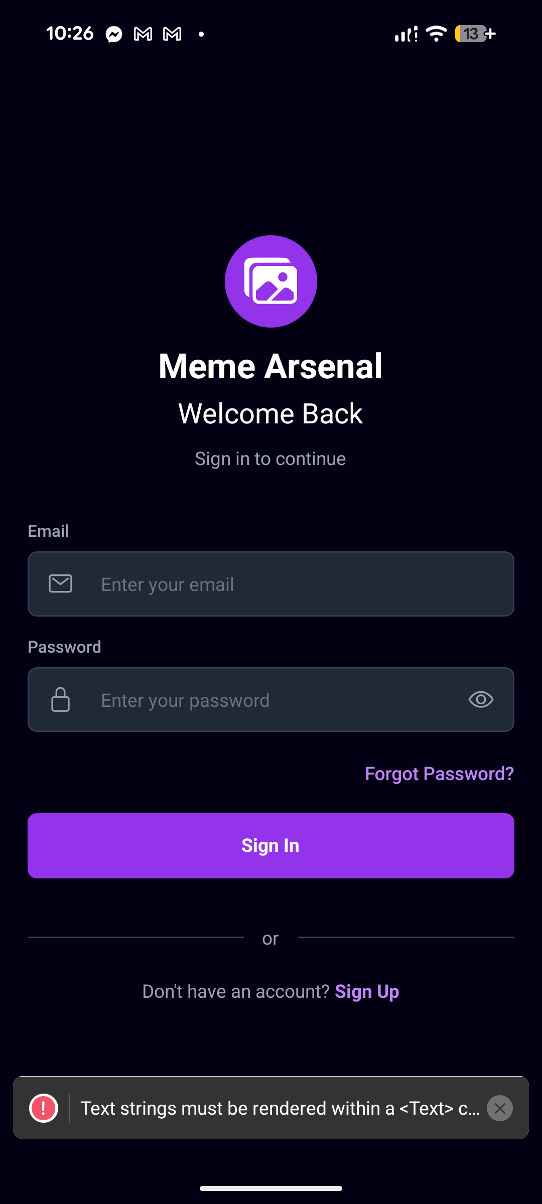
A lot of the things related to login/logout/account creation are directly connected to my backend; Supabase.
Login – Logic & UI
For login I keep things simple: email + password, basic validation, then hand off to Supabase via my auth context.
-
I store
email,password,loading, andshowPasswordin local state. -
When I tap Sign In, I:
- Check both fields are filled.
- Call the relevant functions related, which verify email, and password and connects them to Supabase Backend.
- If there’s an error, I show an alert with the backend’s message.
- On success I call
router.replace('/(tabs)')so the login screen is removed from the stack.
UI-wise, the screen is a dark full-height layout with:
- A centered logo circle (purple background + images icon) and the text “Meme Arsenal / Welcome Back”.
- An email field with a mail icon and rounded dark input.
- A password field with a lock icon and an eye/eye-off toggle.
- A “Forgot Password?” text button that navigates to the reset flow.
- A full-width “Sign In” button that turns into a spinner when
loadingis true. - A small “or / Sign Up” section at the bottom to jump to the signup screen.
Sign Up – Logic & UI
Sign up is slightly stricter because I enforce username and password rules before touching the backend.
-
Local state holds
email,password,confirmPassword,username, and visibility flags. -
On Create Account, I:
- Make sure all fields are filled.
- Ensure passwords match and are at least 6 characters.
- Re-run the username validation and show an alert if it fails.
- Call the relevant backend functions to create a new account, verifying the parameters.
Inside AuthContext:
- If the sign-up works, I also insert a row into the
profilestable with the newuser.idandusername.
On success, I show an alert telling the user to verify their email, and then router.replace('/(auth)/Login') to bring them back to the login screen.
The UI mirrors the login style:
- Same dark background and logo circle.
- Inputs in order: Username, Email, Password, Confirm Password (each with an icon and show/hide toggles for passwords).
- A Create Account button with a spinner when
loadingis true. - A small terms text and a “Already have an account? Sign In” link at the bottom.
Logout & Session Handling
Logout is handled centrally in the auth context and exposed as
- On the Profile screen, I show a red-accent “Sign Out” button.
- Tapping it calls the relevant components related to verifying email, which tells the backend to sign the user out.
In
- When there is a valid session, I set
userandsession, thenrouter.replace('/(tabs)'). - When the session becomes
null(after logout), I clear the user and redirect back to the Login screen withrouter.replace('/(auth)/Login').
So the flow is:
- Sign Up → create account + profile, then back to Login.
- Login → validate, sign in via Supabase, land on the tabbed app.
- Logout → sign out of Supabase, auto-redirect back to Login.
signOut.AuthProvider I subscribe to supabase.auth.onAuthStateChange:
Backend
I kept the backend as simple as possible: I use Supabase as my “backend in a box” for auth, database, and file storage.
For data, I set up a few basic tables:
- one for profiles (username, avatar, bio, member since)
- one for folders (folder name, color, owner, is it public or private)
- one for images (image URL, which folder it belongs to, whether it’s a favorite)
Every time I create a folder or add a meme, I’m really just inserting a new row into those tables. When the app loads, I read those rows back and use them to rebuild the folders and images in the UI. That’s what lets everything persist between app sessions and across devices instead of living only in local state.
Auth is also handled by Supabase. When someone signs up or logs in, I call the Supabase auth APIs through my AuthContext. Supabase gives me a user session, and I store a matching profile row in the profiles table. The auth listener in my context watches for session changes and automatically pushes the user into the main app when they’re logged in, or back to the login screen when they log out.
For files, I didn’t want to keep raw images in the database, so I upload them to Supabase Storage. When I add a meme, I upload the file, get back a public URL, and then save just that URL in the images table. I do the same thing for profile avatars. This keeps things lighter and makes loading faster.
Supabase storage was super easy to implement, and technically is a cloud service!! Which fulfills what I had originally wanted to do.
However, in the future I will probably migrate to a much more secure cloud service.
All of this backend logic is important because it gives the app a real sense of account ownership and sync: folders, memes, favorites, and profiles are all tied to a user, stored centrally, and can be fetched again on any device. My React Native code mostly just calls small helper functions that talk to Supabase and then updates local state to match whatever the backend says.
Implementation
The Implementation of Supabase was pretty easy. I just created a new project, and viola! I had to create a .env file within my scaffolding to connect supabase with my app. Importing the keys was kind of difficult but I managed to get the hang of it, and successfully do it.
Schema
For Supabase, you need to create schema to import everything related to the app.
My schema consisted of all the relevant things, relating to user profiles, such as the profile information, settings info, folders info, images info, etc.

After the Schema was completed and I added all the relevant things- I added RLS (Row Level Security) to everything to ensure that none of the user information could be accessed by unauthorized users.
Safety first, always.
Supabase Storage
Supabase, as mentioned previously, is cool in the fact that it has it's own cloud storage service included in it.
With this in mind, I create multiple storage facets, for user images.
I created 2 dedicated folders, one for the user's profile pictures, and another for user-content.
These would only contain images that the user has saved directly to the backend:

AND That's that! The official beta of the app was complete!
Logo Creation
Before I go and publish the app I needed to create a logo.
I originally envisioned this; a purple folder with a silhouette of a rifle appearing out of it.
I know that sounds edgy, and very stupid, but I deadass thought that that would get point across, and I needed something as a placeholder before I and submit the app to the Google Playstore.
So, I booted up Adobe Illustrator and I designed something simple:

I KNOW THAT IT LOOKS STUPID! BUT I NEEDED TO MAKE SOMETHING QUICK!
After that was done, I began to work on the publishing.
Publishing
At first, I had no idea how to publish an app to the Google Playstore.
However, thankfully there was this YouTube video available that guided me along the way to submit the app:
https://www.youtube.com/watch?v=sruasvn7klU
This is where I may have made the first mistake in the Publishing process:
When creating the google Developer account, I used one of my personal email accounts instead of creating a dedicated email for app-related business.
Next, I needed to created authenticated authorized administrator accounts for my app using Google Developer console, and connect them with my app.
Afterwards, I needed to verify my app and explain what it was, and it is just a image saving and sharing social media app.
Now he's my problem:
Google has this ridiculous verification system set in place, where I MUST use a state issued form of identity to verify my Google Developer Account before I can begin to publish apps.
The purpose of this, according to Google, is to mitigate fraud from big-name companies, but they apply it small creators as well, which is funking ridiculous. Google's excuse is that they'll eventually lift the restrictions for small developers in the future, but I want to publish my app asap.
Typically, I am pro privacy, and I don't want to give out my sensitive information out, especially not to some good-for-nothing Spyware company like Google, but I really wanted to publish the app because I was pretty proud of it, and wanted to see it on the app store asap!
So I used my driver's license to verify my identity, and I had to wait a few days before I could get my account verified.
But apart from that, verifying was my final thing I needed to do:

But then I ran into another problem:

The ID I had submitted, my driver's license, had expired by the time of submitting it. It expired exactly on my 21st birthday, and I turned 21 about a week after.
And I just renewed my license, and I was waiting for the new one to come in! What a pain in the fucking ass! This meant that I had to wait a few more days before I could publish my app >:( !!
What a fucking bummer.
Conclusion
The development process of my app was really fun. I learned a lot about React-Native, TypeScript, Expo Go, and the App publishing process.
I'm really grateful to have the ability to create this app, and to also be in a time with AI. Ai helped me debug a lot of the issues within my app.
The app took me about one month to development, and I think I started the initial development process sometime in December 20th? And I got to publishing around Janurary 31st. So about a month and a few days.
Anyways, I decided to name my app: MemeArchive . And I know that doesn't really sound too original - but I figured it gave the point across right away.
Anyways, yeah, I had a ton of fun with the development of this app.
Additional Notes + Images
I took screenshots of the development process of the app, it's not in complete chronological order, BUT I wanted to put the archive of the development some place:


Anyways, that's that!
Thanks for following the development of my app!
-- Devv